I was excited for this book cover project to come my way. I had only designed one other book cover, and wanted to do another one. This one had the potential to be a fun creative challenge, something I had been in need of when the project came along.
During our discovery session, I asked the client a series of questions, about the book, the audience, and what emotion and feeling he wanted the cover design to elicit from a potential buyer. The client had a concept in mind for the cover, but was open to new ideas as well. His editor and I both felt that the visual concept he brought to the table wasn’t right for the audience.
The audience demographic for the book is 30 – 60+, college educated, and feels like they are missing the point of life, that they are not being authentic and genuine. The book guides the reader through a pragmatic approach to making different choices to regain a sense of themselves.
The book would be considered in the self-help and/or spirituality genre. Both are subjects that can be intimidating, especially for potential buyers who would likely be overwrought and facing a transitional period in their lives. So the cover design would need to be approachable and spark curiosity.
Below is the concept the client had in mind:
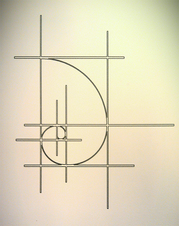
It is the Golden Ratio—a mathematical ratio thought to be present in nature and to have a pleasing aesthetic. As I mentioned, both his editor and I felt the visual was too abstract and intimidating. I worried the image would lead viewers to see the book as mathematical or scientific, and think that it would be a difficult read. Not quite the impression we wanted to make with the book cover design.
During the discovery session, I asked the client to explain the idea behind the concept and what he felt it represented. He said the the swirling line represents the notion that as humans we are in motion, our essence is fluid. The lines are stark and sterile and represent the things that block you in, where you feel stuck. But inside those walls you are still fluid and moving. So the idea behind the image is pretty abstract, but when he explained it I understood why he liked the concept. However, it did not convince me that it was the right approach visually. Conceptually it made sense and fit the nature of the book, but it needed a better visual representation.
Fortunately, the client was open to other ideas, so we agreed that I’d incorporate the golden ratio visual into one of the concepts in addition to other concepts.
As part of the discovery process, I ask clients to choose from a list of adjectives that describe the look and feel they want the design to have. The client chose: colorful, friendly, feminine, light, simple, serene, minimal, elegant.
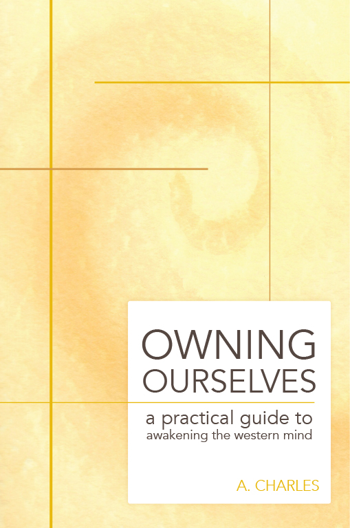
I came up with five concepts. For the concept that incorporated the Golden Ratio, I did a monochromatic watercolor painting of a swirl. I added the line work digitally. It was still my least favorite concept.
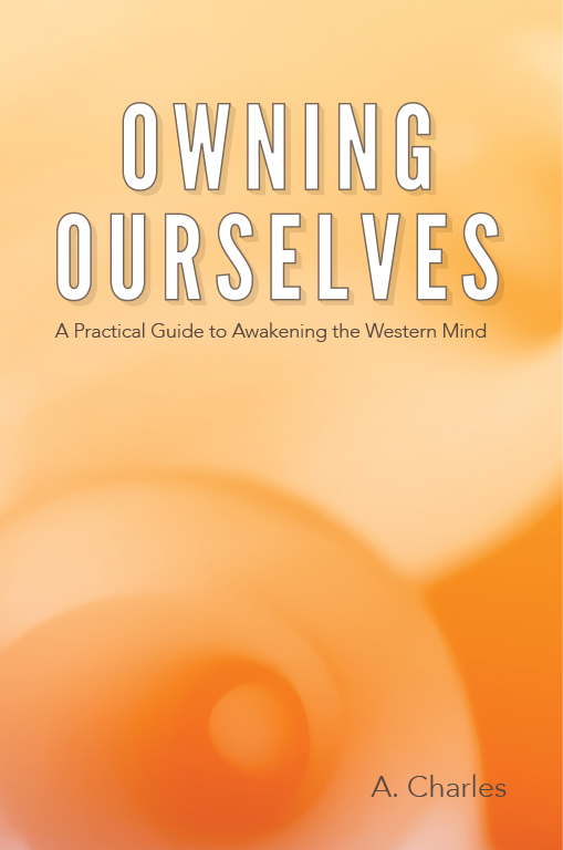
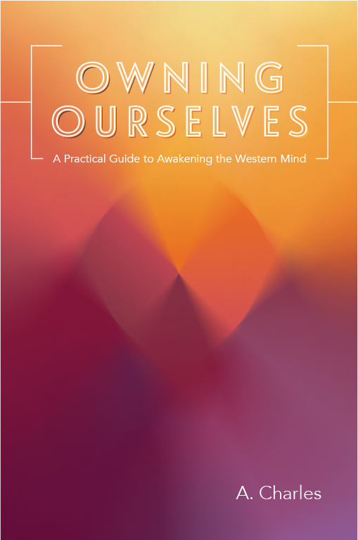
Drawing on the notion that the golden ratio can be found in nature, I used a black and white photograph I had taken of some Calla Lilies, blurred it and applied a yellow-orange overlay to create an abstract swirl design. Still not my favorite concept, but another take on the golden ratio visual.
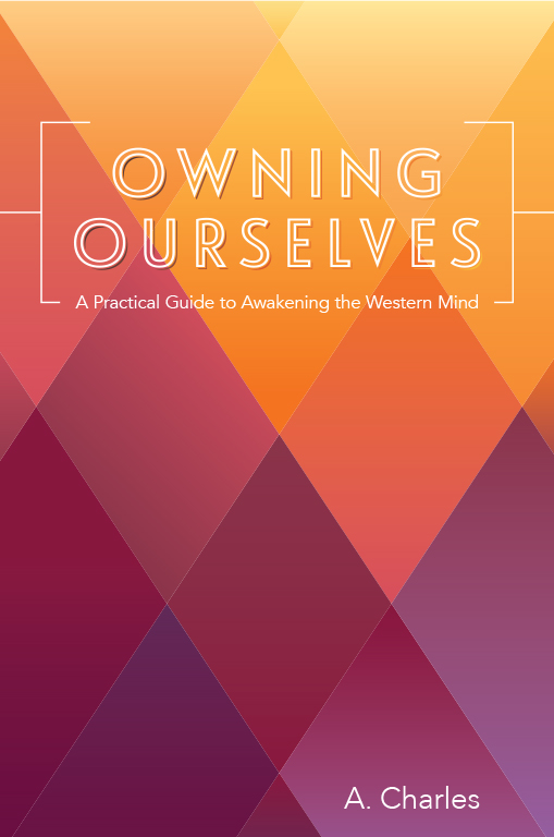
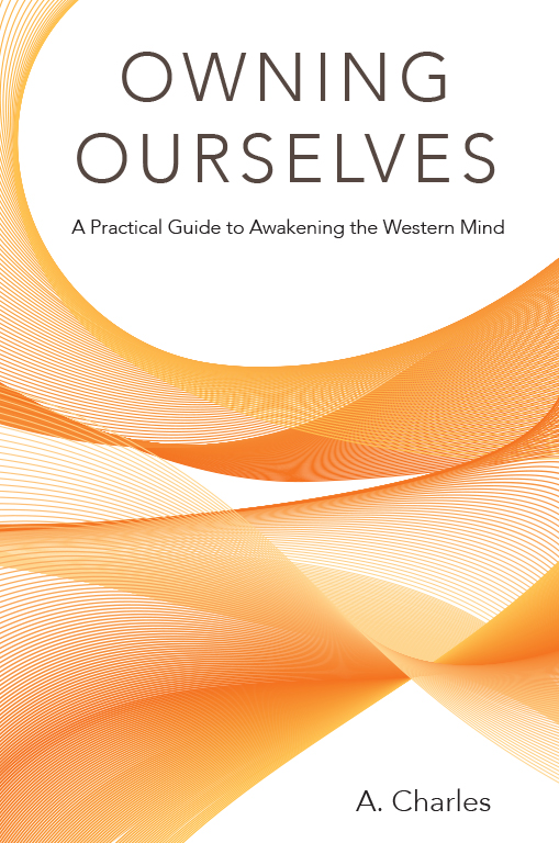
The next two concepts are variations on one pattern. The diamond pattern implies a sense of order, the graduated shades of color represent fluctuation. The variation on this pattern blurs and abstracts the diamond pattern giving a sense of motion.
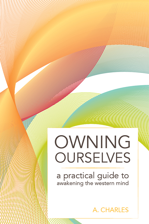
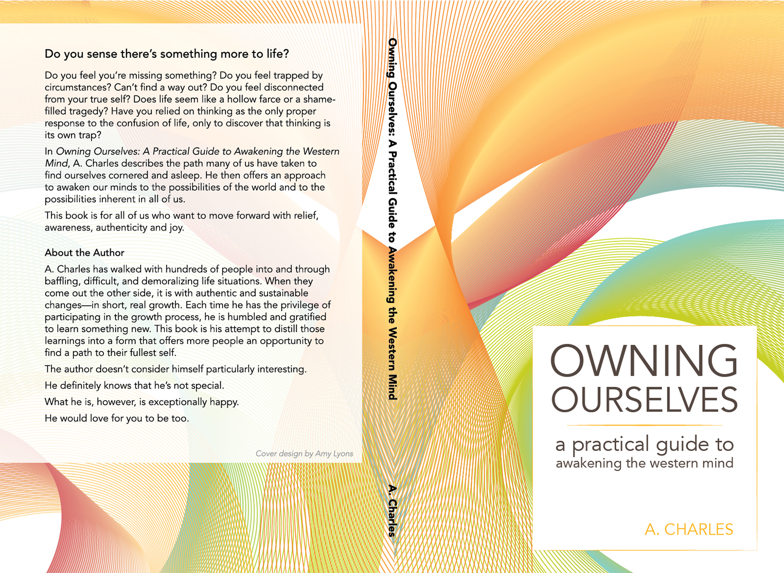
My favorite concept was the chosen concept. I created a swirly abstract pattern using blended lines and graduated colors. I felt it was the best representation of the client’s concept, with the sense of motion and fluidity he desired. There are twists and turns, and the shapes overlap, and combined they create a stunning visual. The colors are bright and energetic, and the movement is graceful rather than chaotic.
The first iteration I used a monochrome color palette. The client wanted more color, so the next iteration added in the colors, which really made the design come to life. The colors are bright and energetic, and the movement is graceful rather than chaotic.
While this was a challenging project, I am really pleased with the final design and even more so that the client loved it.
“Thank you. You did a terrific job and it was a true pleasure working with you. You exceeded my expectations…I am thrilled with your work.”